


Looking at competitors can answer practical questions very quickly. How many steps do they use before signup is complete? Where do they ask for payment? What happens when a user skips onboarding or reaches a limit? These details are more useful than collecting attractive screenshots because they show how a product actually moves people through a task.
In This Article (7 sections)
The problem starts when observation turns into imitation. A competitor may use a certain flow because of its pricing model, audience, technical limits, or business priorities. The same solution may make little sense in another product. Competitor UX research should therefore focus on decisions, friction, and sequence, then use those findings as input for your own design rather than as a template to copy.
This guide turns that approach into a repeatable process, with a flow matrix you can copy and the mistakes that turn research into imitation.
What You Need Before You Start
Competitor UX research goes faster when the inputs are ready before anyone opens a competitor product:
- One task that matters to your product. Signup, first project creation, upgrade, cancellation or inviting a teammate.
- Three to five competitors. Enough to see a pattern, few enough to compare in one table.
- Access to each flow. A free account, a trial, or a recorded flow from a UI pattern library.
- A place to store evidence. Screenshots or recordings named by competitor and step, so every note can be traced back.
- Your own product evidence. Analytics, support tickets, usability test notes or interview transcripts for the same task.
Each prerequisite serves one goal: an expected result your team can act on. If a competitor flow sits behind a required plan or an admin permission you cannot get, use a recorded flow for that step and note the gap, because a step you never saw is a failure point you cannot judge. Any whiteboard or design tool works for the mapping, and our roundup of UI and UX design tools covers the main options.
Define the Task Before Opening Competitor Products
Start with one task that matters to the product. A broad competitor UX review often produces observations that are hard to compare. A narrower question might ask how three competitors introduce a paid plan or handle cancellation. Nielsen Norman Group recommends defining the goal before a competitive evaluation because the goal determines what should be compared. Clear scope helps separate useful patterns from decorative details.
Use the same task for every competitor. Record the starting point and successful end state before judging color, type, or layout. A simple checklist can include:
- user goal and entry point
- number and order of steps
- information requested
- decisions, confirmations, and error states
- places where a user can leave
- final state after completion
This structure keeps each comparison tied to the same problem. It also supports the focused competitive analysis recommended by Nielsen Norman Group.
Map the Journey Before Judging Individual Screens
A single screen rarely explains a complete flow. Onboarding can include account creation, verification, permissions, setup, an upgrade prompt, and a first useful action. Page Flows records real product journeys with screens and recordings. Current examples include onboarding for Discord, HubSpot CRM, Canva, and Typeform. You can visit their website to inspect surrounding steps instead of treating one screen as the whole experience.
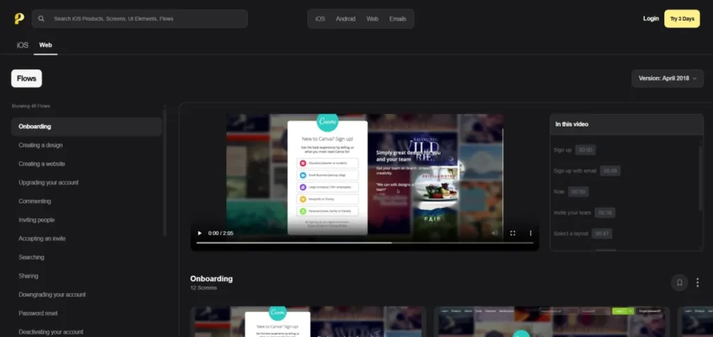
Recorded flows show one path on one date. Walk the live product yourself where you can, and check the states a recording often skips: a declined card, an expired invite, a skipped setup step, or a user who returns after a week.
The useful unit of comparison is often the transition between states. Note what the user knows before a step, what the product asks next, and what changes after the action. Two competitors can use different visual designs while relying on a similar decision structure. Similar screens can also lead into very different next steps. Mapping transitions exposes those differences without reducing the research to visual taste.
A practical way to capture each transition is three short notes per step:
- Before: what the user has been told so far.
- Ask: what the product requests or offers at this step.
- After: what the user can now do that they could not do before.
Friction should be recorded where it occurs. Nielsen Norman Group recommends checking journey maps for unmet expectations, unnecessary interactions, low points, difficult channel changes, and time spent. Baymard’s checkout research shows that usability problems within a conversion flow can contribute to abandonment. It also separates UX related causes from other reasons, including purchase intent and price comparison. That distinction prevents teams from treating every conversion drop as a design problem.
The numbers show why. Baymard puts the average documented cart abandonment rate at 70.22% across 50 studies, yet 42% of US online shoppers say they abandoned a cart because they were just browsing or not ready to buy. Once that group is set aside, 17% point to a checkout that was too long or complicated.
The output can stay simple. A table can place competitors in columns and journey stages in rows. Each cell can record what happened, what information was required, and where friction appeared. Add another column for evidence from analytics, support conversations, usability tests, or user interviews. Competitor behavior is evidence about competitors, not proof for your users.
A Simple Competitor Flow Matrix
The matrix should separate observation from interpretation. One field can state what a competitor does, while another records why the choice may matter. A third field can show whether the same issue appears in your own research. This reduces the chance that a repeated competitor pattern is treated as an automatic best practice. Nielsen Norman Group reports that journey maps become more actionable when insights, opportunities, ownership, and metrics are included.
| Journey Stage | What the Competitor Does | Why It May Matter | Seen in Your Own Research? |
|---|---|---|---|
| Entry point | Where the user starts and what the first screen promises | Sets expectations for every later step | Landing page or campaign data for the same entry |
| Account creation | Sign-up options and every field requested | Shows what the product needs before any value is delivered | Form analytics or drop-off by field |
| Verification | Email, phone, or other checks before first use | Security or data quality, at the cost of a channel change | Verification completion rate |
| Setup and permissions | Questions, imports, invites, and access requests | Personalization or required data, or friction that delays value | Setup completion and skipped steps |
| Upgrade or payment prompt | When and how a plan choice or payment request appears | Reflects the pricing model and sales motion | Upgrade and cancellation feedback |
| First useful action | What the user can do once setup ends | Shows how quickly the product delivers its core value | Time to first key action |
| Exit points and error states | Where the user can leave and how errors are handled | Shows how the product recovers a stalled user | Support tickets and error logs |
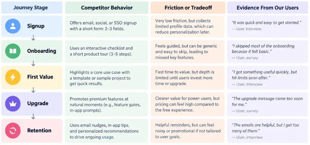
Look for Friction and Tradeoffs, Not Winners
Competitor UX analysis becomes more useful when it stops asking which product has the best flow. A short onboarding process can reduce early effort but postpone important setup. A longer process can collect more information while adding more work for the user. Step count alone does not explain quality.
Baymard found a related pattern in checkout research, where form field count can matter more than page count. Its 2024 benchmark found the average checkout had 5.1 steps and 11.3 form fields, while most sites need only 8 fields.
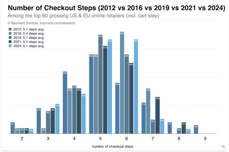
In plain terms, the average checkout asks for 3.3 more fields than most sites need, which is why field count says more about effort than step count does.
Record what each decision seems to optimize. One competitor may prioritize speed, another security, and another personalization. Compare those tradeoffs with the goals and limits of your own product. This turns competitor research into a context based decision. Nielsen Norman Group notes that competitive testing with users can reveal strengths and weaknesses across competing experiences.
The table below shows common onboarding patterns and the tradeoff behind each one. Use the last column to decide which patterns deserve a test in your own product.
| Pattern You See | What It Tends to Optimize | What It Can Cost | Question for Your Own Product |
|---|---|---|---|
| Signup with no setup questions | Speed to first screen | Generic first experience, setup pushed later | Do our users succeed without early setup? |
| Long setup wizard | Personalization, cleaner data | Early drop-off, more effort before value | Which answers change what the user sees next? |
| Card required before trial | Lead quality, trial conversion | Fewer trial starts | Is trial volume or trial quality our bigger problem? |
| Email verification before use | Security, valid contact data | A channel change at the start | Can verification wait until a later step? |
| Upgrade prompt at a usage limit | Upgrade intent at a moment of need | Frustration if the limit is hit mid-task | Where do our users hit limits, and what are they doing then? |
Turn Competitor Research Into an Original Design Direction
The final deliverable should contain principles and open questions rather than copied screens. Summarize where competitors reduce effort, introduce friction, request information, and change the user’s next decision. Then remove brand names from the notes and ask whether each conclusion still fits your users, business model, and technical limits.
If an idea feels convincing only because several competitors use it, the evidence remains weak. When the same issue also appears in your user research or product data, it becomes a stronger candidate for testing. Competitive research is most useful when it reduces uncertainty without deciding the design in advance.
From there, sketch your own flow from the principles, not from the screenshots. Low-fidelity work keeps the team focused on sequence rather than styling, and our comparison of wireframing tools covers options for that stage. Teams that want a clickable version quickly can try AI prototyping tools, as long as the prompt describes your principles and not a competitor’s interface.
Common Mistakes in Competitor UX Research
These are the errors that turn a competitor study into a screenshot collection or a copy. Each one has a simple fix.
Collecting Screens Instead of Flows
A folder of screenshots shows how products look, not how they work. Fix: name every capture by competitor and step number, and always capture the screen before and after the one you care about.
Treating Popularity as Proof
Five competitors asking for a phone number at signup tells you what is common, not what works. They may share the same sales model, or they may have copied each other. Fix: move any pattern that relies on “everyone does it” into your open questions until your own data supports it.
Skipping Error and Exit States
The happy path is the easiest part to record and the least informative. Fix: trigger one error per flow, such as an invalid email, a declined card or a skipped step, and record what the product does next.
Copying the Surface
Copying layout, copy text, illustrations or visual style is where research turns into imitation. Fix: keep only the decision in your notes (“asks for team size before the first project”) and design the screen that serves that decision from scratch.
FAQ
These questions come up once a team starts its first competitor study.
How Many Competitors Should a UX Study Include?
Three to five is a workable range for one task. Fewer makes it hard to see a pattern, and more makes the matrix hard to read. Add an indirect competitor when your users compare you with a tool from another category.
Is It Legal to Study Competitor Products This Way?
Observing a product you can access as a normal user is standard research practice. Reproducing its visual design, copy text or assets is a different matter, so check each product’s terms of service before automating anything, and ask a lawyer about any specific use you are unsure of.
How Is Competitor UX Research Different From Competitive Usability Testing?
Competitor UX research is an expert review: your team walks the flows and records what happens. Competitive usability testing puts real users in front of your design and competitors’ designs, then compares their reactions. The review is faster and cheaper, while the test shows how users actually respond.
How Often Should Competitor UX Research Be Repeated?
Repeat it when a competitor ships a major change to the task you studied, or before you redesign that task yourself. Recorded flows show one date, so note when each flow was captured, then test your principles with users instead of copying the design.
About the author

Macedona is the founder and lead reviewer at SaaS CRM Review, where he has published 175+ in-depth reviews, pricing guides, and comparisons of CRM and SaaS tools. Each review is based on hands-on testing or verified documentation, and every article states clearly which method was used. Pricing and features are checked against official vendor sources, with the verification date noted in the article. Macedona follows a published review methodology and editorial policy. SaaS CRM Review earns affiliate commissions from some links, which never influence ratings or rankings. Read the full affiliate disclosure.